A logo is the prime visual component of your company’s overall brand identity. It’s how people recognize you, how they regard you, and helps communicate some information about who you are and what you stand for, across in one simple visual.
The importance of great logo design is the difference in how your audience perceives you, which is why it’s really important that you get your logo professionally designed. It matters that you like it, but even more vital is that it was clearly thought out, and well designed. Its extremely important that your logo is able to relate directly to your target market. There is no point in you liking a logo that may not grab your audience.
Sagi Haviv, partner at a New York graphic design firm, responsible for some of the most recognizable US business logos says that “It’s never love at first sight. A good logo, a good trademark, gains meaning and power over time.”
Sometimes you’re not a fan, and sometimes you think your idea of a cat with a colorful party hat idea is better at representing your brand then a solid font and simplistic lines.
I’ve had to explain to people over the years the importance of hiring a professional graphic designer over conceptualizing and creating a logo themselves. Everyone believes that they are creative, and therefore can come up with something wonderful and original. It’s not always easy to convince clients that graphic design, although a very creative field, is actually more problem solving than artistic. Although aesthetics are important, our job as designers is not just to make something look “pretty”, it’s to communicate ideas visually. The challenge is to relay information across in a simple graphic. We have a few seconds to grab attention and make a connection.
A professional designer has been trained to understand how lines, space, colors and fonts all convey certain emotions and connotations. We’ve been taught the psychology behind these elements, and how best to use them to communicate effectively.
Here are 5 logos that I think do a good job of representing their brand, and communicating effectively:
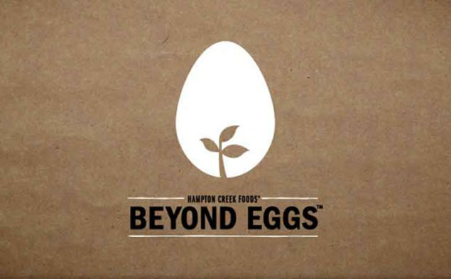
Hampton Creek Foods
I like Hampton Creek Foods logo because it’s a simple logo that depicts a plant growing inside of an egg. It clearly communicates a plant-based egg product or alternative, with a really strong font stating trust and authority. It’s uppercase and in black which shows stature and power. The play on negative space in the graphic is minimalistic and easily recognizable. White is often used to represent purity, and happens to also be associated with low-fat foods.
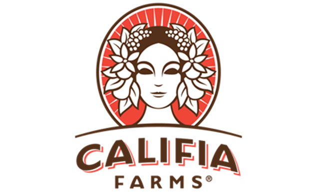
Califia Farms
Califia Farms’ logo is a great combination of all the elements being really thought through and put together so well. There is information being communicated with every line, graphic and color, without us even being fully aware of it.
The line depicting a hill symbolizes the outdoors and farming while the softness of it also brings a sense of friendliness. The sun symbolizes life while the woman is a sign of nurture and compassion. The leaves, flowers and fruits all depict nature, or natural. The color brown for the outlines could be the representation of earth while the orange is often used to communicate warmth, compassion, confidence, happiness and general wellness.
They’ve really thought of every aspect and every element to communicate that their brand is compassionate, healthy and natural and will give you the consumer a sense of happiness and health.
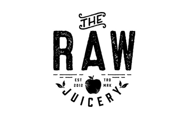
The Raw Juicery
I’m really enjoying the retro style of logos that have been coming into play in the last 2 years or so. This one is simple and it’s trendy. Of course it shows fruits indicating that their product is plant-based, and the use of the emblem really solidifies their confidence and brand-like, sub culture feel. It reminds me of a fashion label, and inspires me to want to get in on it and be a part of it (whatever it is). I want to drink their juices just so I can fit in with the cool kids is how I read this logo, like it’s the new “in thing”. The logo also kind of looks like a big smiley face, and any product that results in me being happy? I’m in!
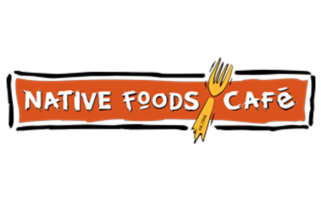
Native Foods Cafe
This logo is rustic, its animalistic and has a “prehistoric man” feel to it. The rough lines, and edges of the font reminds me of cave drawings. Being a plant-based restaurant, I’m wondering if they were playing with the idea of a vegan diet being the original diet of man. Did you notice they used a fork with no knife? Leaving out the knife symbolizes compassion over killing and violence, and definitely communicates the vegan aspect across efficiently. The use of orange suggests confidence, happiness and compassion, but is also cleverly used in this setting as orange is a popular color used in restaurants to encourage the feeling of hunger and contentment.
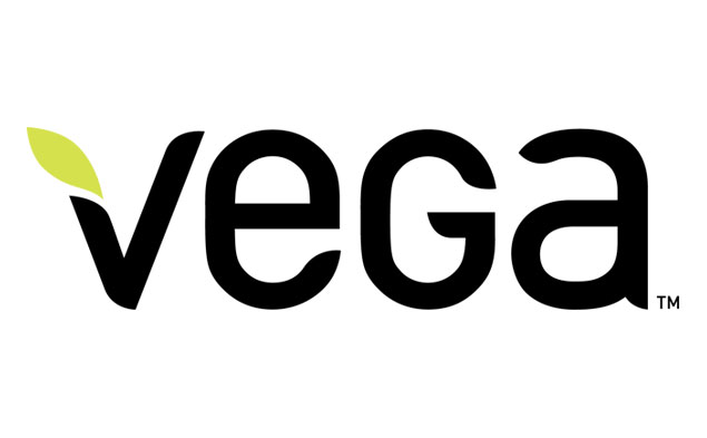
Vega
The font used here is strong yet, soft, organic and plant-like. This together with the leaf of the “V” speaks a feeling of nature, which is obviously fitting considering that Vega supplies plant-based protein and supplements. It’s very similar to the vegan icon of the “V” and the leaf. Black is a color of authority and strength which is really appealing for those wanting to bulk up and build muscle who happen to be the big buyers of protein supplements. Green is directly related to nature and energy, and is often used in the advertising of drugs and medical products to indicate safety and health.


Diggin’ your insight Shiri!
Thanks Christina!